Love it or List It Vancouver’s popularity can be attributed to the fun synergy and intelligent expertise of Jillian Harris and Todd Talbot, but it’s most successful because, well, who doesn’t love a new kitchen?! We invite you to explore the images and descriptions of some past episodes below, all featuring custom kitchen cabinets by Merit Kitchens.
We want to help you fall back in love with your kitchen, too! Contact us today and an experienced designer will walk you through your kitchen cabinet options or complete kitchen and bathroom renovation project.
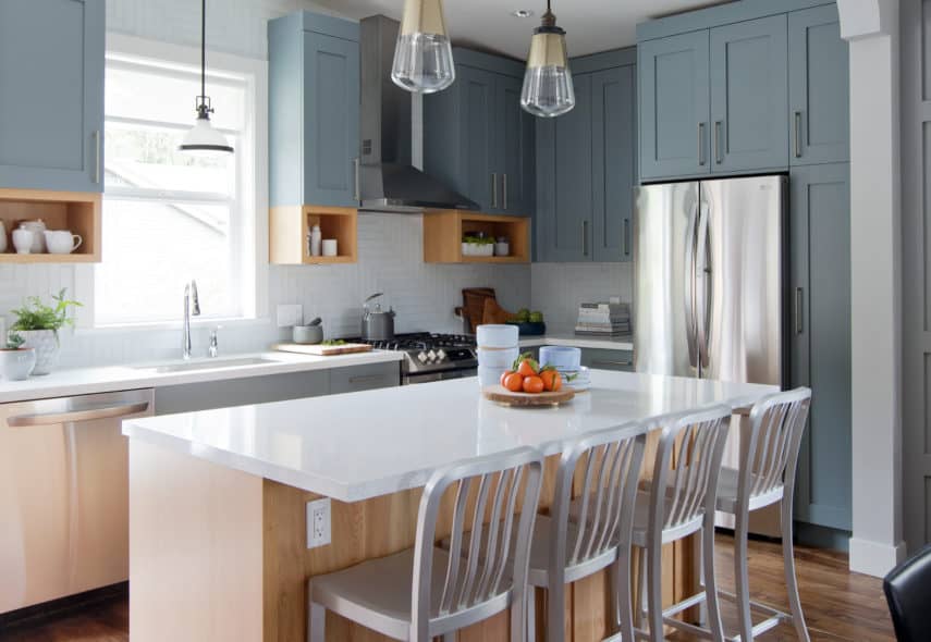
Jane & David
Old homes can come with plenty of charm, but often feature spaces that lack modern-day functionality. Jane, David and their two teens moved to be closer to nature, but ended up buying a home that was expensive and needed a lot work – especially in the kitchen. Jillian to the rescue.
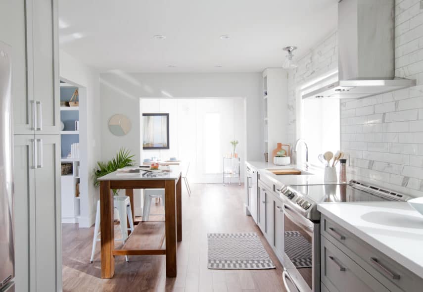
Stephanie & Chris
For Jillian’s to convince Stephanie to stay in the same house that Chris grew up in, nothing short of a stunning redesign was required. Stephanie’s frustrations over her tiny kitchen are a distant memory due to Jillian’s brilliant galley design. The kitchen is spacious, and functionality is everywhere with large cupboards and extra counter space. The function kitchen island is a great place for meal preparation, or after-school homework.
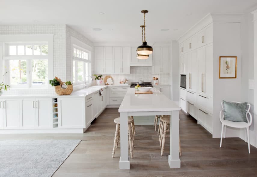
Christine & Chris
Christine and Chris moved to the West Coast and found the heritage home of their dreams. It’s a beautiful house in one of the country’s priciest neighbourhoods, but the kitchen was ridiculously small given the size of the home. Jillian created a beautiful, open-concept kitchen with lots of storage, beautiful cabinets and an inviting, large centre island – a perfect place for the family to hang out.
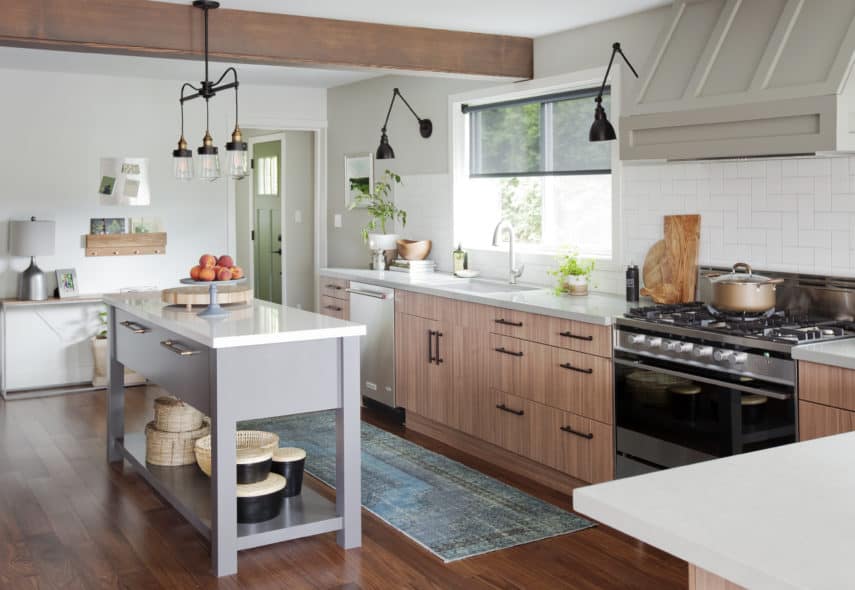
Mary & Calvin
Mary and Calvin love to entertain, but a home with a choppy layout and small kitchen made that difficult. As restaurant owners, having a beautiful, function kitchen was Jillian’s top priority. A gorgeous, open concept kitchen, complete with new appliances, Merit Kitchens cabinetry, and a custom island has created the perfect space for cooking and spending time with friends and family.
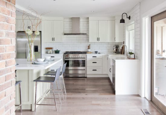
Brandy & Aaron
Brandy and Aaron have outgrown their single-level home. And with Brandy in a wheelchair, creating a function, accessible layout is essential for Brandy and Aaron to fall back in love with their home.
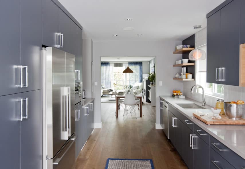
Kim & Teri
Galley kitchens often feel cramped. But not this one. The elegant blue hues coupled with thoughtful wooden elements and bright shades of white has created an open and airy space.
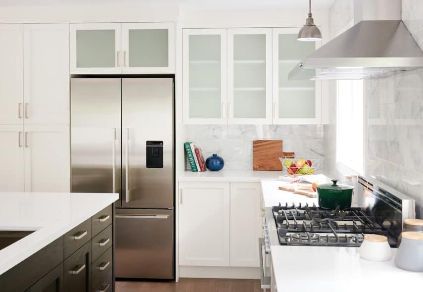
Nancy & Lucky
It was nine years ago that Nancy and Lucky bought their three-bedroom home. When their third daughter joined the family, the home was no longer big enough. Especially with all five family members fighting for time in the home’s single, functioning bathroom.
Jillian Harris and her design team were enlisted to create a functional home the entire family could love.
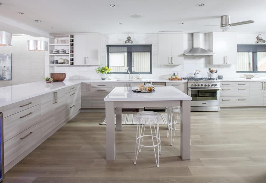
Linda & Chris
Linda and Chris, along with their two teenage daughters, were desperate for a home makeover. This active family of four were living in a home with a chopped-up floor plan and not enough living space to accommodate everyone’s needs. Designer Jillian Harris was tasked with opening the layout and creating a functional space the entire family would enjoy.
Elana & Brian
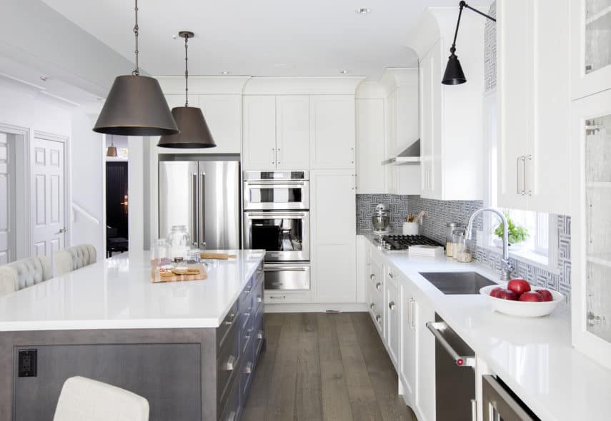
Jillian Harris and her talented Love It or List It Vancouver design team transformed the entire main floor of Elana & Brian’s home into an entertainer’s dream in hopes of convincing the owners to stay.
The back half of the home was changed into a functional, open-concept space. It features a kitchen complete with an eat-in area, mini mud room and second living area.
Jessica & Derek
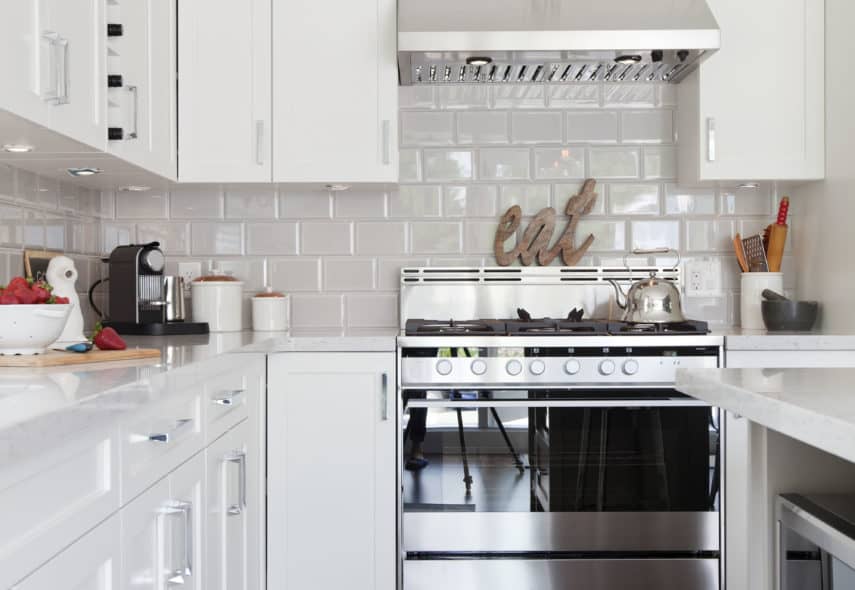
Jillian and her Love it or List it Vancouver team convinced Jessica & Derek to love their house again – it must have been the Snow white and Haze gray Shaker kitchen by Merit! The cabinets showcase the designer favorite Manor Flat, Painted MDF door style, and the unique, double-stacked flat crown moulding extends to the ceiling, lending a sense of modernity not offered by angled crown moulding. Finally, a wine rack placed amidst the run of wall cabinets provides decorative relief.
Rachelle & Tim
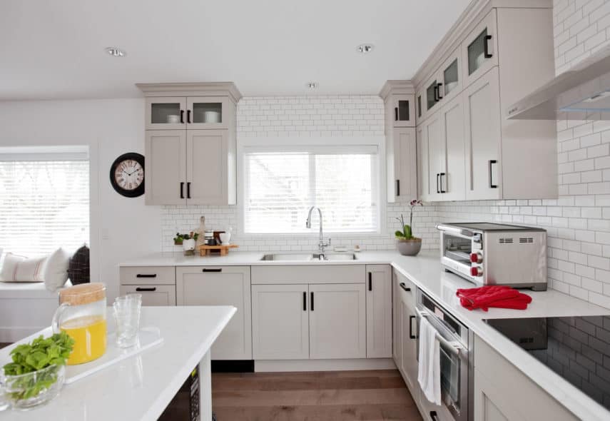
Brightening up Rachelle and Tim’s home was challenging for Jillian and her team, until they selected pale, Haze gray cabinets for the kitchen to make the entire space brighter, fresher, and airier. The stacked wall cabinets – boasting the Manor Flat, Painted MDF door style – add height, and the glass-top doors offer an attractive place to display treasures. The paneled dishwasher provides a pleasing run of uninterrupted base cabinetry and dark, bronze hardware punctuates the kitchen design and adds drama.
Meg & Neal
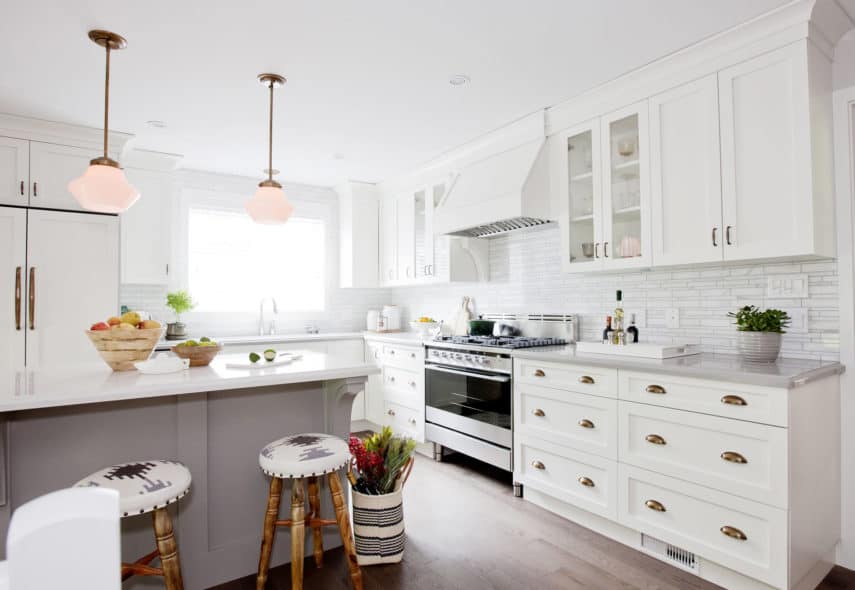
For Meg & Neal, Jillian created an open concept living and dining space, with Powder white and Smoke gray cabinetry from Merit to lighten things up. Many designer details are showcased here: the refrigerator is paneled with the same Manor Flat, Painted MDF door style as the kitchen cabinets to integrate it seamlessly; the decorative, painted wood hood hides the sharp, metal corners of the hood fan; beefy corbels and moulding anchor the island in the space; and aged, brass hardware lends warmth and old-world appeal.
Lyanne & Chris
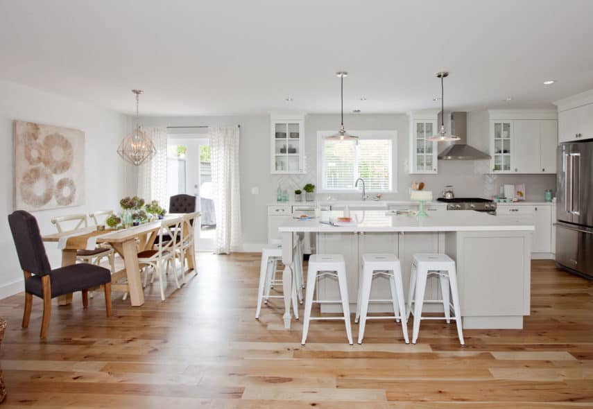
Jillian’s challenge was that Lyanne & Chris’ home lacked the necessary square footage for a growing family of four. So, walls were removed, completely opening up the main living space to the kitchen and dining room, making the home feel more spacious. Snow white, Manor Painted MDF wall cabinets with French Country glass doors provide the illusion of depth and space, as well. Seating on two sides of the Haze gray island creates a multi-use area for socializing or working.
Talia & Travis
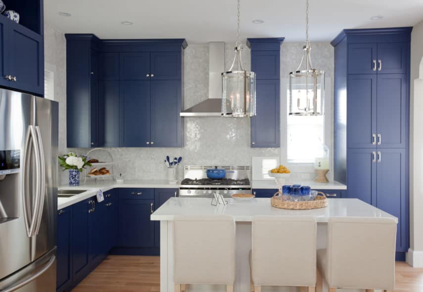
Talia & Travis’ custom sapphire blue and Snow white Merit kitchen is functional elegance at its best. A generous pantry and stacked wall cabinets extend to the ceiling, adding a sense of height to the small space while maximizing storage. Jillian chose to panel the dishwasher to blend it seamlessly into the cabinetry. Decorative, open shelving is placed above the fridge and on the island. The colour of the kitchen cabinets and Manor door style are a nod to the vintage home, while the functionality is all modern.
Lisa & Derek
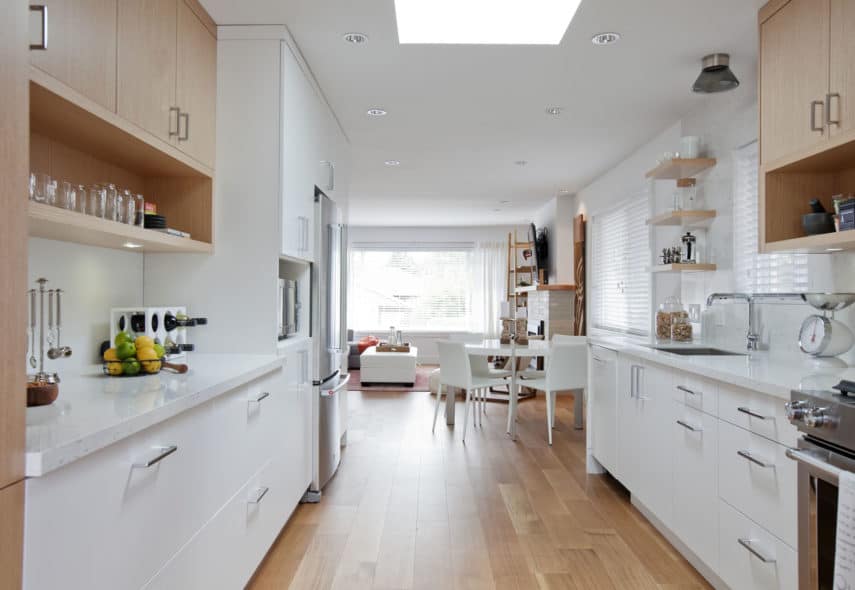
Jillian’s biggest hurdle was creating an improved layout and functional living space for Derek and Lisa. Often considered small, one-cook spaces, this galley kitchen defies expectations. It is open, bright and features ample work space for two. The Metropolitan White Oak cabinets add warmth and texture to this contemporary, white Merit kitchen. Double-thick cubbies and floating shelves provide interest and variety, as well as an opportunity to display. Finally, large, deep drawers offer easily accessible storage.
Dawn & Brian
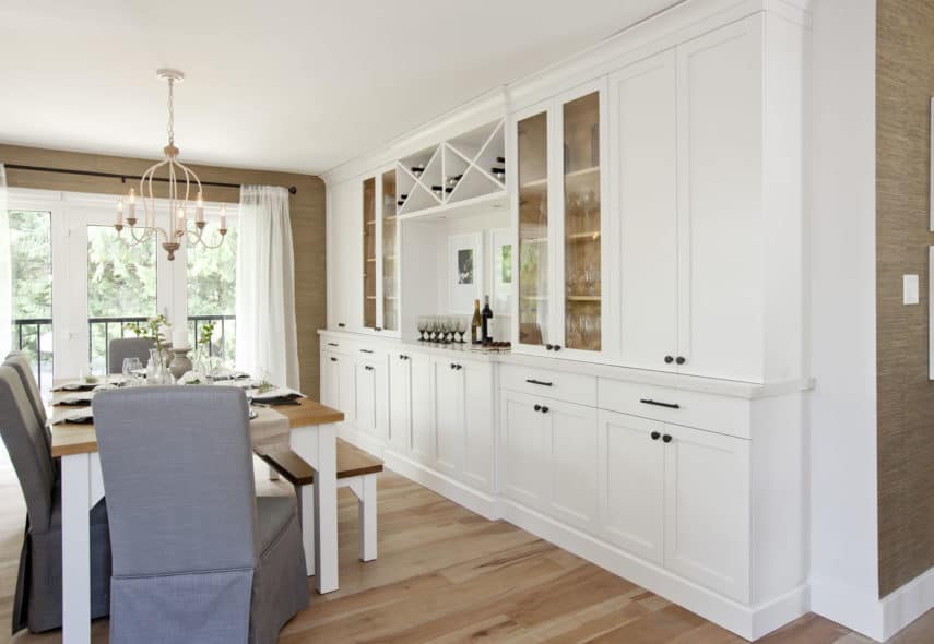
Jillian illustrates how cabinetry can be used throughout the home for a cohesive look, in Dawn and Brian’s episode. The Frost white, Painted MDF Manor Flat cabinets from the kitchen are also used in the dining room to create a sideboard, wine bar, china cabinet, and pantry all rolled into one. The wood interior of the glass cabinets is kept natural to tie-in with the floor, and provide visual relief from the otherwise all-white cabinetry. Finally, criss-cross wine racks provide an interesting, geometric touch.
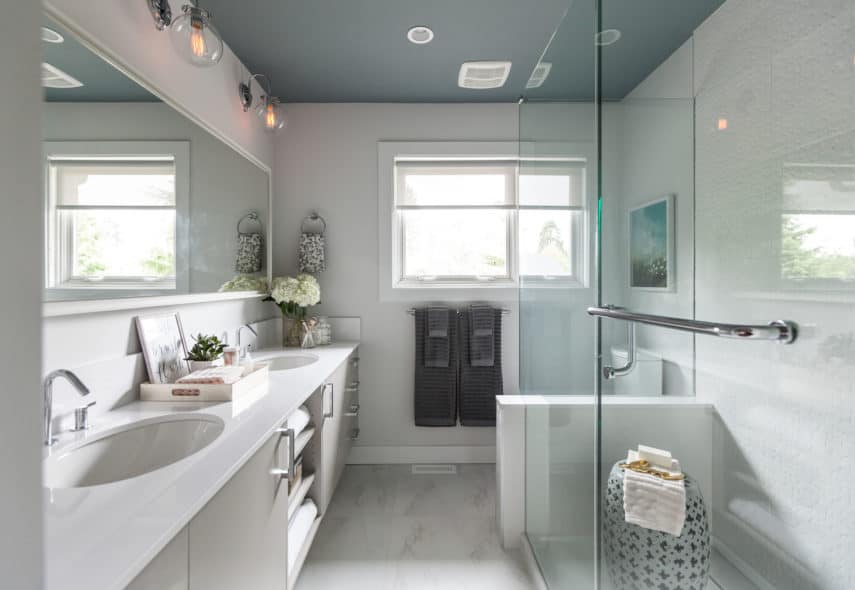
Alia & David
Alia and David purchased their first home together in a suburban area. It was within their price range but in major need of repair and updates. They wanted one, preferably three, new bathrooms, a new backyard, laundry room and additional storage in order to fall back in love with their home.
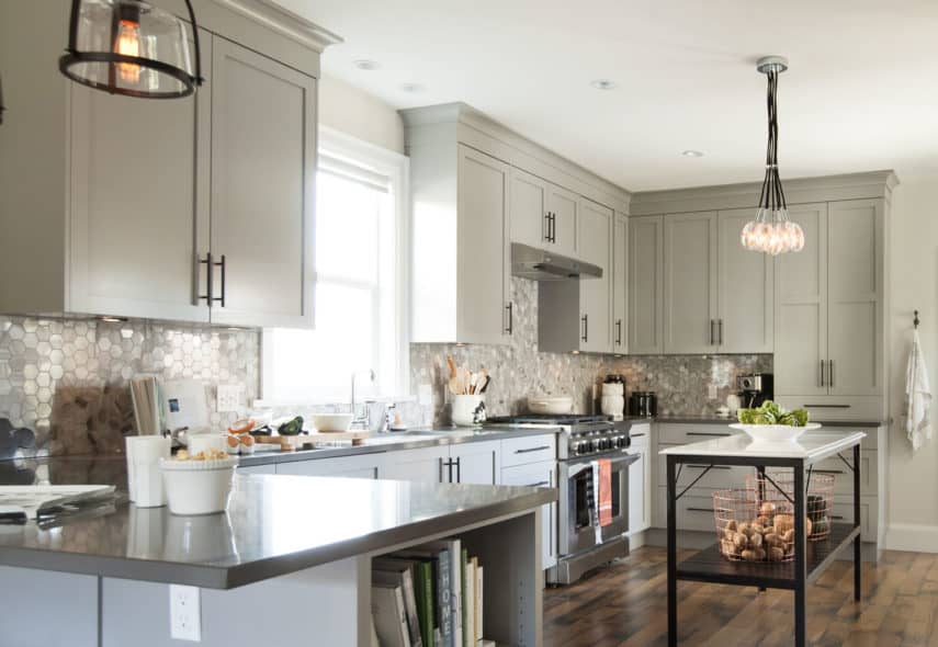
Belinda & Sam
Belinda & Sam’s 100-year-old character home was in need of a major renovation. In addition to creating a mud room for the kid’s hockey gear, the family wanted to redo the Master Bath and ensuite. Opening up the main floor of the house to accommodate the growing family was also on the homeowner’s list of requirements.
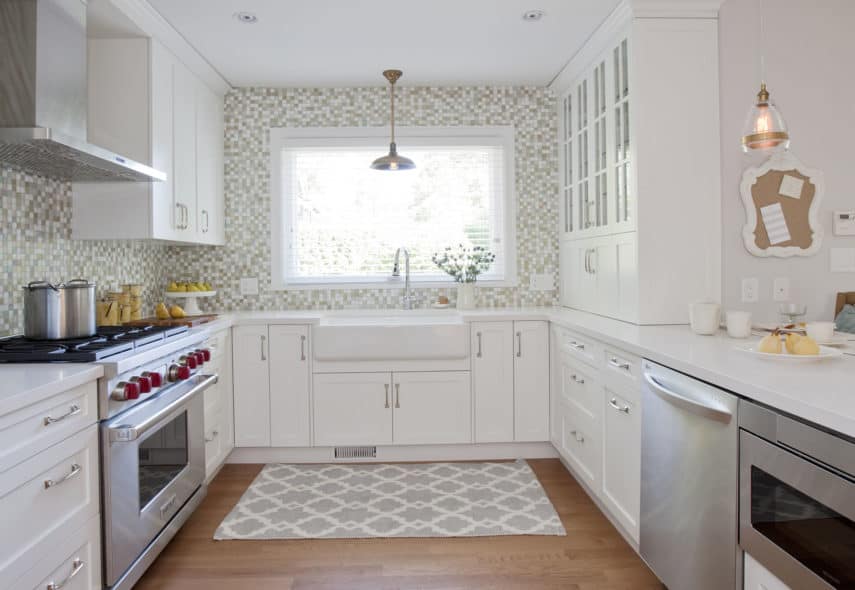
Debora & Paul
Paul and Debora, proud owners of a heritage home, needed help. Paul loves the fine craftsmanship, character and details that come with owning an older home. However, Debora felt she was living in a museum that was slowing falling apart. With this character home, there was a long list of updates and renovations that needed to happen for Paul and Debora to fall back in love with their home.
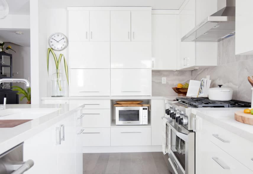
Cindy & Chris
Cindy and Chris had a townhome with a big-house feel but it suffered from a few dysfunctional rooms due to poor and dated design choices. Cindy and Chris needed room for their extended family and friends to enjoy the home.
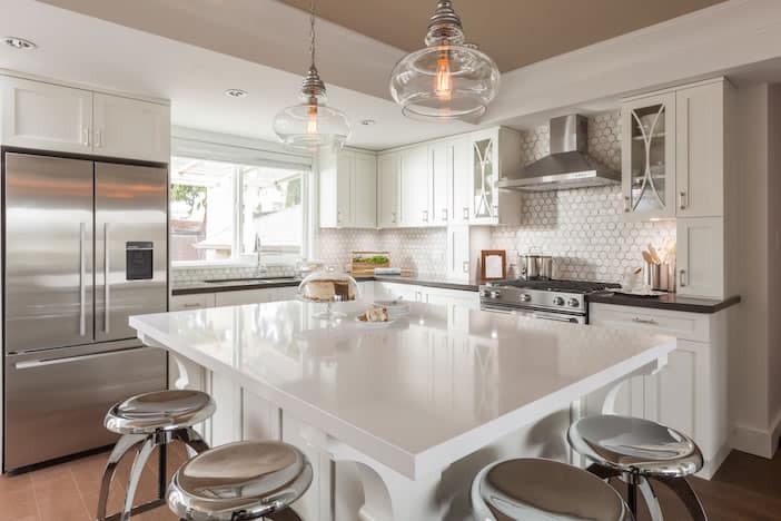
Vivian & Don
Who doesn’t love a character home? But they do have their challenges, especially when it comes to a major renovation or home improvement project.
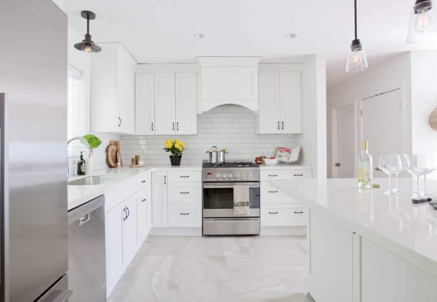
Alice & Jim
Alice & Jim’s little bungalow was too small, and the space was proving to be a source of frustration when entertaining. Jillian and the Love it or List it Vancouver design team were tasked with making the space as functional, and beautiful, as possible.

